What are Norms? Understanding normative data – 2024 Edition
Available in:
EN
To help you become familiar with normative data, we asked the VALD Data Science team to create this easy-to-follow guide on the basics of normative data.
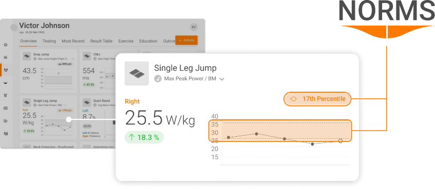
Did you know that VALD Hub features integrated Norms? If you are a VALD client, you’ll now find Norms populated against your athletes’ ForceDecks data on their profile.
Read more about integrated Norms here: https://valdperformance.com/introducing-vald-norms/
VALD clients can also request normative data reports for a range of VALD products, on a range of different sports and cohorts – simply contact your Client Success Manager to enable access.
What are norms?
Normative data (or “norms”) are information from a population of interest that establishes a baseline distribution of results for that particular population.
Norms are usually derived from a large sample that is representative of the population of interest. Medical literature will often publish normative data with population sizes of around 50-100 participants. By contrast, VALD norms are based on data from over one million individuals. This means that we can still produce credible norms (i.e. 50+ samples) for extremely granular populations, such as European female teenage javelin throwers.
This is how we turn the industry’s deepest data into the widest array of normative insights – spanning hundreds of sub-populations.
However, it is important to note that the smaller the sample, the more uncertainty there will be around any estimates made.
Uncertainty can be calculated and expressed using statistics such as 95% confidence intervals. Again, whilst it depends on the question you want to answer, it is a good idea to make sure your sample is relatively homogenous. For example, Figure 1 below shows the concentric peak power results from more than 170,000 countermovement jump tests conducted on over 6,000 NFL (American football) athletes.
However, we know that different positions in American football typically require different anthropometric and athletic attributes. Accordingly, the distribution of results from e.g., Defensive Line athletes versus Wide Receiver athletes could differ significantly:
Evidently, looking at NFL athletes as a whole may not be the most informative approach. However, it should also be noted that subsetting the data and looking at individual positional groups will reduce the size of the sample.
Even though the data in the data in Figure 2 is derived from a large number of NFL athletes, it is still small in relative comparison to ideal normative datasets, so the curve is not smooth (normally distributed). However, Figure 3 showcases the power of data when we compare a very large group – in this case hundreds of thousands of individuals.
Considerations for deriving norms
Before attempting to derive a norm, it is imperative to check the data for errors. With large datasets, doing so requires a rigorous data cleansing process. VALD’s data cleansing process is summarised in Figure 4 below.
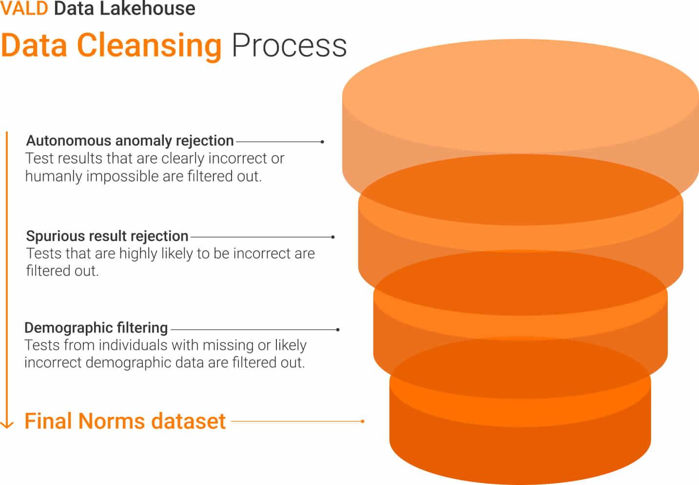
For example, “spurious result rejection” involves automatically removing extreme outliers, based on a combination of domain expertise and statistical techniques. The outliers may have been caused by accidentally triggered tests, incorrect test protocols or other issues in the data collection process, but regardless are able to be automatically detected as false and removed from the dataset.
Checking the distribution of your data
When working with continuous data, it is important to be aware of the distribution type of your sample. There are formal methods for assessing distributions, but in this case we are able to visually assess our sample’s distribution using a histogram.
From this histogram we can clearly see that our sample’s distribution is approximately normal.
When looking at between-limb asymmetry, we can use a negative value to denote an asymmetry in favour of the left limb and a positive value to denote an asymmetry in favour of the right limb. In this case, we might expect our between-limb asymmetry sample to also be normally distributed.
However, when considering norms for between-limb asymmetry, we typically should not be concerned with whether the asymmetry favoured the left or right limb – the focus will most often be on the magnitude of asymmetry.
If we convert all our negative results to positive results and remove any reference to limb, we can see that our sample’s distribution has changed.
We now have a positively skewed distribution, which is what we should expect for between-limb asymmetry data – more observations closer to 0% and less frequent occurrences of larger asymmetries.
What descriptive statistics should you use?
Once we’re aware of the distribution of our data, we can use this information to decide what statistics to use to describe our data.
Whilst it ultimately depends on the question you wish to answer, a general rule of thumb is that the mean is appropriate for a normal distribution (e.g. our CMJ peak force data) but may not be appropriate for a skewed distribution (e.g. our between-limb asymmetry data).
The median is considered to be a more robust measure of central tendency that is appropriate in the case of a skewed distribution or outliers. Figure 8 shows a comparison of the mean and median of an arbitrary variable with a normal distribution:
In cases of a normal distribution, the median will closely reflect the mean. In cases of a skewed distribution, the median can provide a more appropriate measure of central tendency and is less affected by outliers than the mean. Given this, it can be a good idea to use the median (and the interquartile range) to describe your data.
What are density curves?
Whilst histograms are useful to show the frequency of results across the range of your data, density curves provide an idealised representation of a sample’s distribution. Figure 9 shows how the density curve compares to the histogram for our CMJ peak power data:
When looking at a density curve, the height of the line is often misinterpreted as the probability of that particular result occurring. In actuality, it is the area under the density curve that provides us with the probability of a result falling between a particular range.
For example, the total area under the density curve will always equal 1, indicating that there is a 100% probability that a result will fall between the observed minimum and maximum. The grey shaded area on Figure 10 shows the area under the curve between 50 W/kg and 55 W/kg:
Through eyeballing the density curve, we could probably guess that the orange shaded area takes up less than 10% of the total area under the curve. However, if we want to properly estimate the probability of a result falling between these two values, we can do so by identifying the total number of results between 50 W/kg and 55 W/kg and dividing this result by the total number of observations in our sample.
In this case, the probability of a result falling between the two values is equal to 0.05, or 5%. Whilst this level of specificity can be useful, often the height of the curve alone can tell us whether a particular result is more or less likely.
Given this, you may sometimes see density curves without a y-axis. It can also be common to see density curves with the first quartile, second quartile (also known as the median) and the third quartile displayed.
The first, second and third quartiles are equal to the 25th, 50th and 75th percentiles respectively. These lines can be used to make some quick and easy inferences about our sample. We identify that 25% of our data fall below the first quartile (at 55 W/kg), 25% our data fall above the third quartile (at 76 W/kg) and 50% of data fall between these two points.
Other methods of visualising a sample
Box and whisker plot:
Whilst you may or may not be familiar with density curves, most people will have likely come across another method for visualising the distribution of a sample – the box and whisker plot.
The above figure highlights that the density curve is simply an extension of the box and whisker plot. In addition to showing the minimum, the maximum and the key quartiles, the height of the density curve also gives us an indication of the likelihood of a result occurring.
Violin plot:
Another way to visualise the distribution of a sample is the violin plot:
The violin plot is simply a double-sided density curve. It is common to use a point and error bars to indicate the median and interquartile range (IQR).
Key information from a sample can also be easily summarised in a table. Key percentiles, such as the 1st (close to the minimum), the 25th (second quartile), the 50th (median), the 75th (third quartile) and the 99th (close to the maximum), can provide us with a basic idea of a sample’s distribution. Table 1 displays the key percentiles for our CMJ sample:
Table 1: The key percentiles for CMJ Relative Peak Power (W/kg) of NFL athletes.
| PERCENTILE | 1% | 25% | 50% | 75% | 99% |
| Peak Power (W/kg) | 39 | 57 | 65 | 73 | 98 |
Normative data applications
Norms can be applied in a number of different ways. One example is using key quantiles from a normative dataset as thresholds to identify individuals that may require attention. In the figure below, we have CMJ peak force results for 13 athletes:
The horizontal line at 2,800 N indicates the median from our sample, with the orange shaded area indicating the IQR. Athletes that fall below the second quartile, or the 25th percentile, are easily identified in red.
In the context of peak force, a performance professional might use this information to prescribe targeted strength exercises to our athletes that fall below the second quartile threshold.
In a clinical setting, a practitioner might have a client who is recovering from knee surgery after injuring themselves playing football. After testing their CMJ performance and examining their peak force result, a common question might be, “Is my score good or bad?” Rather than suggest whether a result is good or bad, we can provide the patient with specific context and show them where they sit relative to a similar cohort:
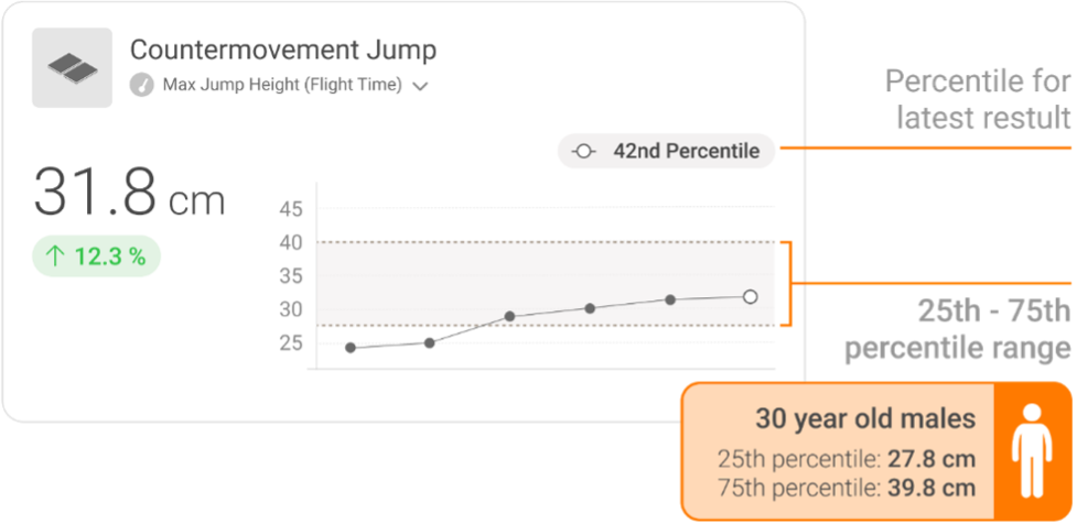
Stating the percentile into which the patient’s result falls can provide unique, valuable context and feedback on their physical status and progression.
How can I access Norms from VALD?
Normative data for ForceDecks is now integrated into VALD Hub. VALD users with ForceDecks data will see Norms directly overlaid on their athletes’ data.
Normative data on other VALD technologies and for specific population normative data can be requested through your Client Success Manager.
If you are unsure how to contact your Client Success Manager, please email clientsuccess@vald.com or support@vald.com.
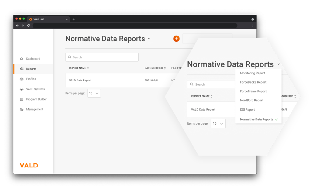
How can I see my normative data reports on VALD Hub?
Once enabled by your Client Success Manager, you can access normative data reports on VALD Hub on the Dashboard. See here for a quick guide.